

Cover Art - 2022
QU!ET is a unique, talented trio who each write, sing, and take the lead on different songs. Each of these singles they’ve released focuses on one of them, and their vocals. Since each member chose to be symbolized by the colors Red, Blue, and Green, each cover reflects this theme for each of them as part of the effort to distinguish each song.
“Jon Bell is a fantastic visual artist. The most important thing to our band is having someone to work with who can take our music, and give it life visually, which is not something we can do on our own. Bell is able to do that by being a great listener, communicator, and simply wants to go in the depths with his clients on putting together something fresh and amazing.”


The Call
This single off their EP focuses on Juliana Pitto and her vocals, so it was important for blue to be the predominant color in the scene.

Far Beyond
This single focuses on Michael Scarabino and his vocals so this time red was the crucial color to aim for.
Neon signs and the dizzying whirl of cars speeding by inspired this scene.

Vein
This single focused on Whiskey Moonshine, so he wanted the main color to be a mix of green tones.
The song is about an insatiable vampire so the main theme felt clear right from the start.
Cover Art - 2021
Just Go Alone
This first single off their EP focuses on Juliana Pitto and her vocals, so it was important to keep the scene mostly blue.
The 3 band members are symbolized by color and Julie's is blue, which coincided well with her desired themes of a rough sea and ominous clouds surrounding a lonely journey.
There’s No Escape
This single focuses on Michael Scarabino and his vocals so this time red was the crucial color to aim for.
We went with a sunset scene: a bridge folded over itself and eroding, against a hazy sunset fog to show the themes of feeling trapped, held back, and pushing through it.
Where We Are
This single focused on Whiskey Moonshine, so he wanted the main color to be a mix of green tones.
First I mixed dark fog, neon signs and a silhouette looking out over silent streets. Then we decided to blend in a neon version of an alternate scene I'd made for them - an M.C. Escher style scene of walls and stairs.
Normal? EP

This EP is the culmination of QU!ET’s writing efforts over the past 2+ years, interweaved with their feelings about the world - the pandemic, relationships, and more.
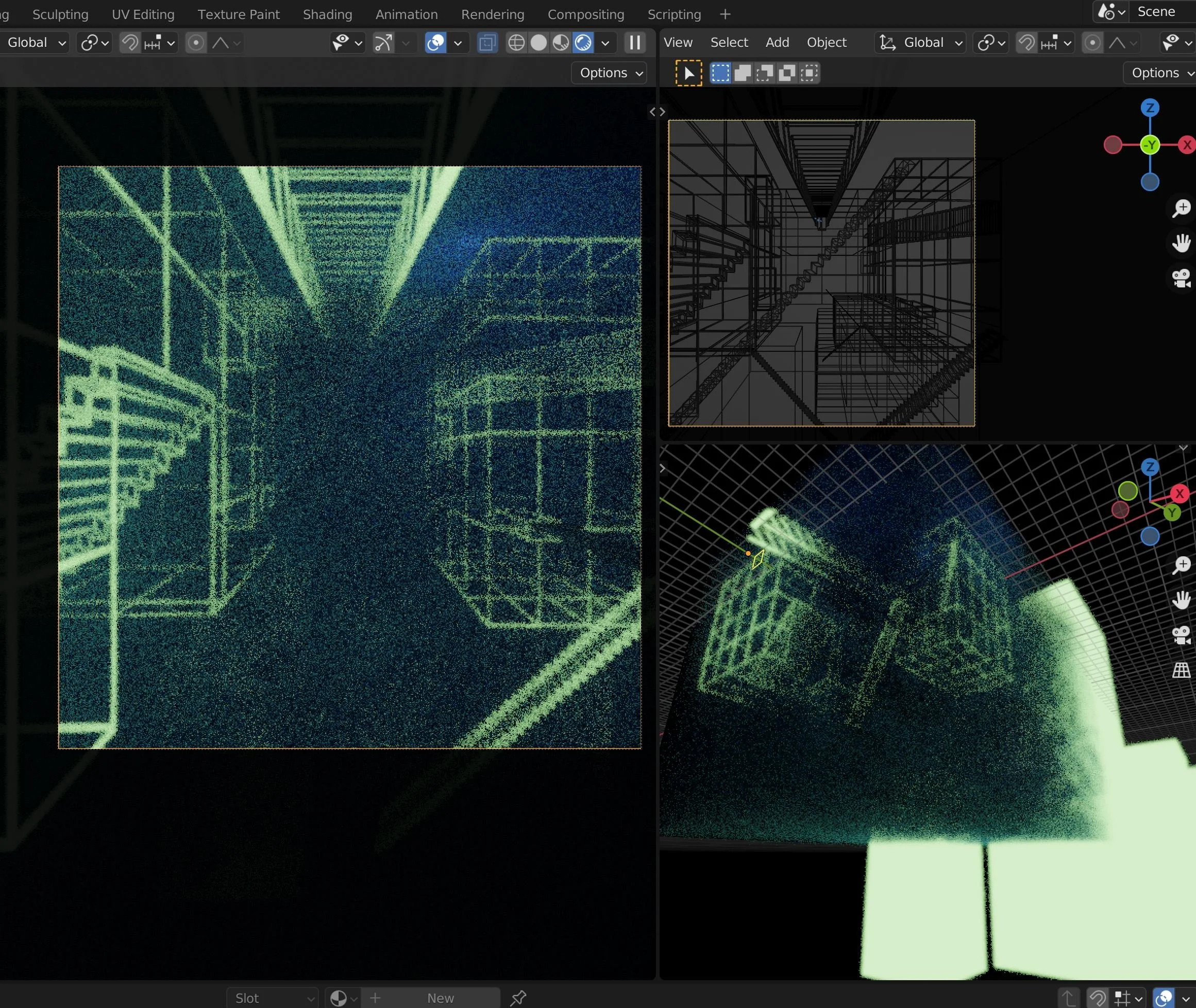
Right off the bat we sought to show the struggle between connection and isolation, while feeling like you’re estranged from your city. From an early sketch to a fully-realized 3D scene, a forced-perspective title winds its way through quietly surreal structures, a hazy ‘static’ that fills the emptiness that melts into the heart of the city. Subtle cues to each band members’ colors (red, green, blue) are peppered in.
Process Shots & Sketches


Wireframe of the final version and a couple early test renders. Fun fact, for Qu!et's name on the waves, I made a little 'invisible projector' to better dial in the angle and brightness (it’s the small white box visible in the wireframe)


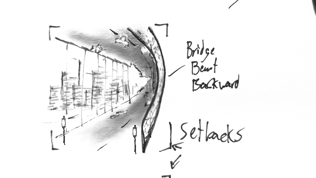
A couple early test renders and a sketch. Some details of the iron supports and decay were influenced by bridges in NY that Michael would often drive past.


Early renders of each cover 'version', alternate views in Blender 3D, and sketches. Some inspiration for the lighting of the original ‘maze’ scene came from a Destiny 2 map Whiskey suggested I look into.
Logo Design


QU!ET’s logo had to reflect the rebellious, ‘loud’, energetic nature of the band, and convince people that they are not, in fact, very quiet! Their very name, with it’s unique use of the exclamation as the letter ‘i’, was a lot of fun to explore, visually.
The main logo is meant to project into the world like the blast of a loudspeaker, represent each bandmembers’ colors as the dots in the exclamation marks, and be sharp and clear at any size or screen.
Inital sketches and drafts centered around a more hand-drawn, organic, punk look, which was then spun off into an alternate logo to put on merchandise.